Choosing a Font for the New Into the Book
Update Posted: 1,099 words
For a website built entirely on the written word, there may not be a more impactful design decision than the choice of a font. Type is the dressing around every one of the words on this site, and the typeface of a site sets the tone, if you will, for the content that readers will encounter within.
Into the Book, for its part, began life set in the venerable Arial. It was free, it was web-safe, and those were the only two conditions that mattered in the choice of a font for a website. At the time, flash-based fonts (using technology like Cufón) were the only way to get premium typography on the web, and I preferred to keep things simpler.
After CSS @font-face landed in 2013, I redesigned Into the Book with full web font support. The body copy was set in OFL Sorts Mill Goudy (such a beautiful serif!), and display/UI text was set in Proxima Nova.
Now, in its temporary form, Into the Book is using the 2020 theme, which is set in Hoefler Text, accented by the striking Inter Text, which is especially calibrated for screens.
Round 1: Typefaces
Even though ItB has (almost) always been set in a serif typeface, I started this exploration determined to find a suitable sans-serif typeface for the site. After all, a blog is a screen-first medium, and it made sense to acknowledge the reality of screens.
Here are some initial explorations to that end:
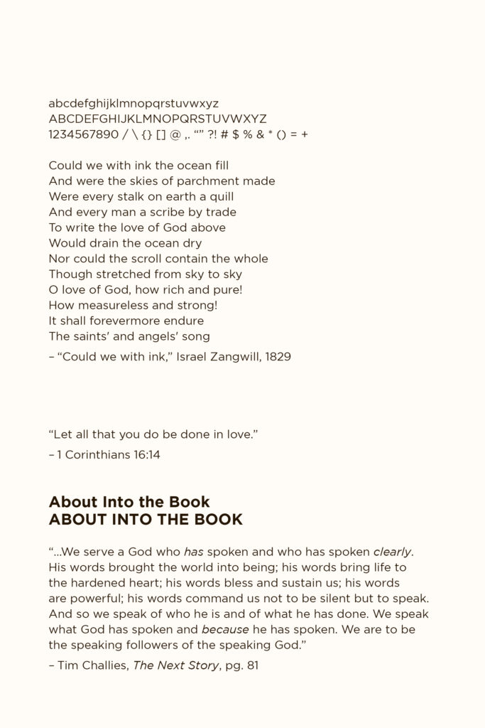
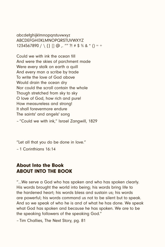
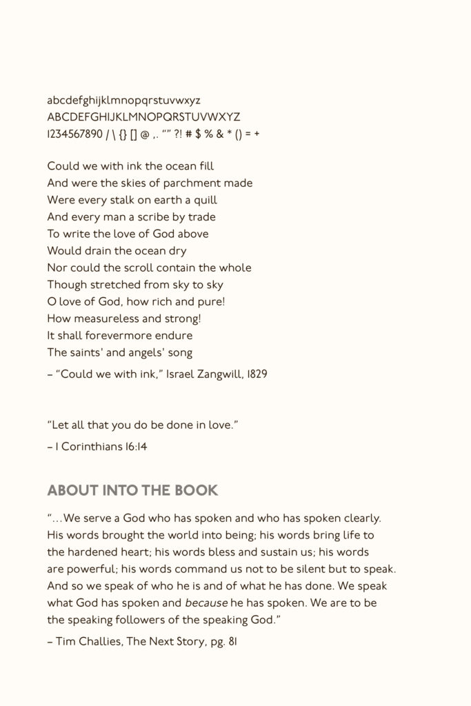
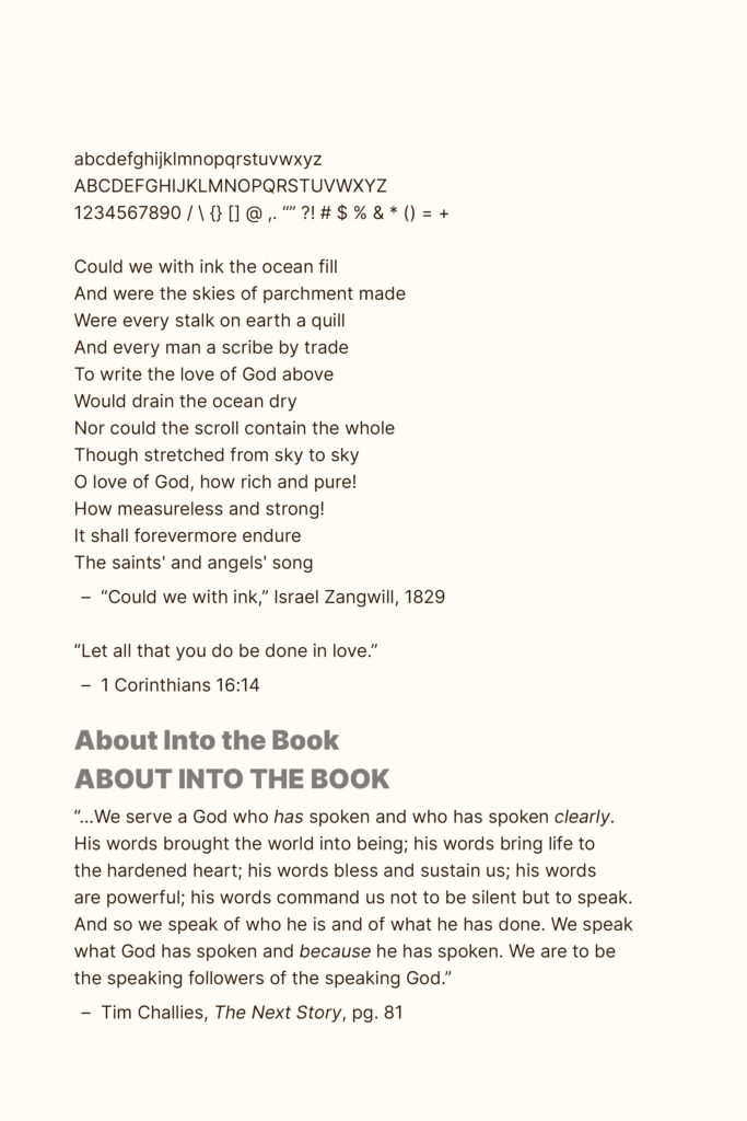
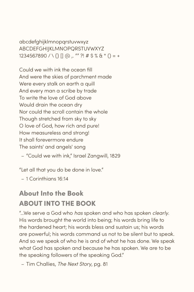
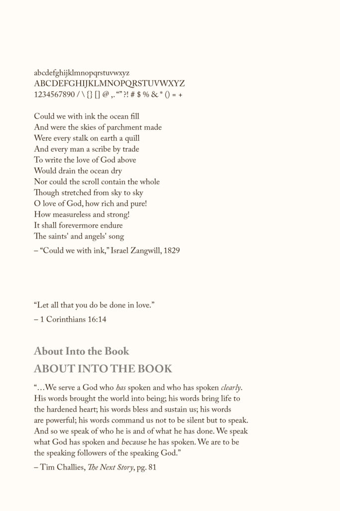
As much as I love it, Neuzeit was the first cut of the six. Underground was also not very successful as body copy. Proxima Nova, for all its great design, is a font I’ve used a lot in the last decade, and I’m ready to move on (I still might consider any of these options for display/heading use on the site).
Inter, though very legible, looks almost bland at regular text sizes. It’s the safe choice, but doesn’t quite match up with my goal of having large body copy.
Sofia is the font I wish Underground had been in lowercase, though I will need to bump the font weight up in the following round. I think at a large enough size it will do very well (it is also extremely similar to Gotham/Proxima, which can’t hurt its chances).
Caslon looks incredibly classic, and if I want to go for the ‘book page in digital form’ look, it’s the obvious choice. I’m still torn between that idea and my original idea of going all-digital.
Round 2: Pairings
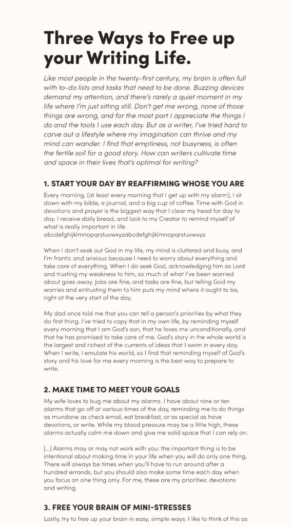
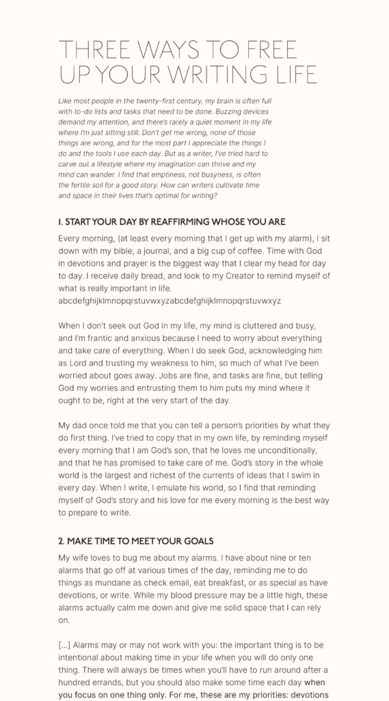
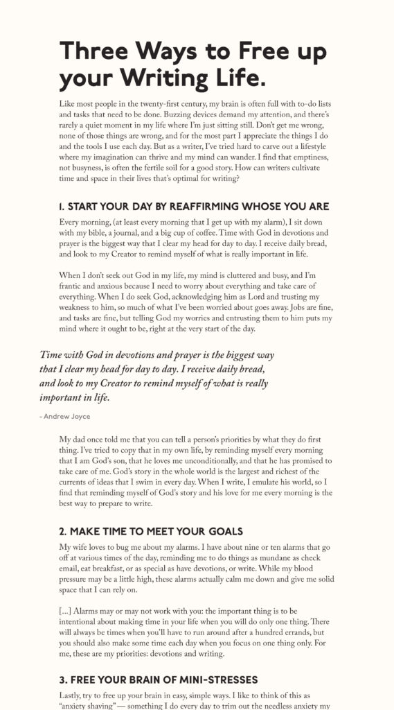
I am in love with P22 Underground, and desperately wanted to use it on the site. As such, I pushed that as the display copy in my next round of options:
Round 3: Winner Winner Chicken Dinner
I found that I couldn’t give up the Sophia headlines. They were quirky without feeling too weird (Underground), geometric without feeling stale (like a kinder version of the Field Notes brand without any less of the charm). This might sound silly, but the capital ‘W’ in Sofia set me over the top — it’s simply perfect.
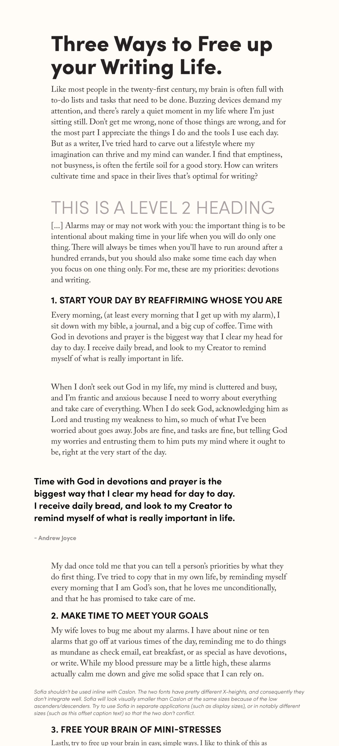
Sofia also handled the quote text perfectly, as well as sub-headings. It had almost all of the personality I loved in Underground (I even left a light-weight heading in there as a nod back to my initial explorations).
Caslon, of course, looks classy and classic as the body copy. I like the idea of a book-like blog the more I think of it — after all, its in the name! I’ve been pondering the intersection of digital and physical media for a while now, so why not bring the 18th-century printed page to the 21st-century web?
The two fonts are quite different: Sofia has a taller X-height with smaller descenders, so they don’t integrate well on the same line. I’m going to be pretty strict about keeping Sofia only for display (and website chrome/navigational text), and Caslon in the body column only.
If you held a gun to my head, I could convince myself to use nothing but Sofia in the body. For some blog posts, maybe that will be the appropriate tone — but we’ll cross that bridge when we get to it.
Up next: design and layout comps — time to get rid of this horrid pink color.