Well-Red: A New Color Scheme
Update Posted: 1,686 words
I’m in the process of redesigning Into the Book in the open. Thanks to COVID, work, life, and other vagaries, this process has taken longer than I expected.
Last time we checked in, we’d settled on a basic typeface pairing. We’re still logo-less and color-less, but I have modified this Twenty Twenty-One template enough to reflect the new fonts. Size/spacing don’t quite match up yet, but we’ll take care of that further down the road.
First, a (not-so) brief look back
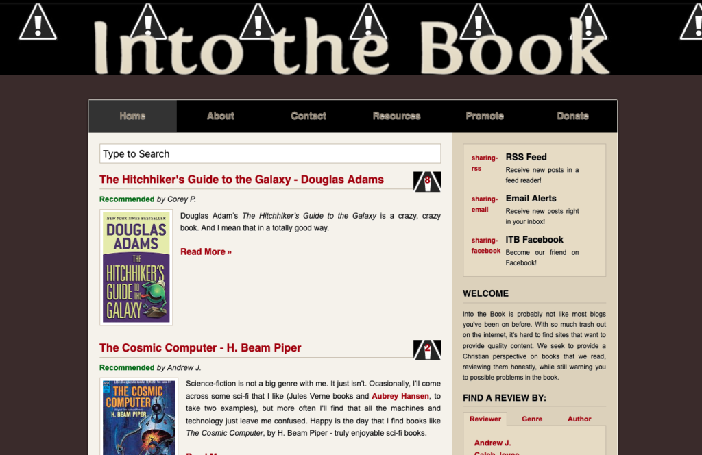
Into the Book started in 2009. At the time, I used a premium Blogger template to get it started. Here’s a partial look courtesy of the WayBack Machine:
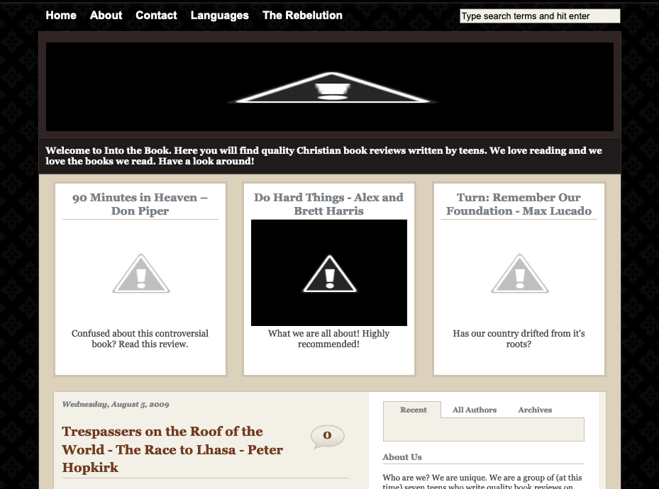
This version of the site didn’t really have any color at all, beyond what the template defined. In mid-2010, I went for my first custom Blogger template. I’d begun freelancing at this point, and was very proud to execute my own design. Overall, Into the Book is a remarkably good barometer for my progression in design skills:
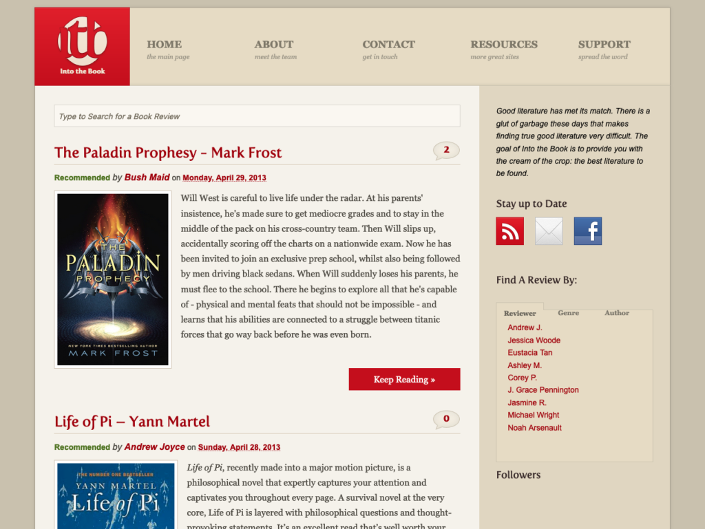
We branched out into Amazon Kindle Direct Publishing in 2014, which called for a rethink of the whole homepage with ‘sections,’ rather than being so review dominated. We also moved to WordPress at this time.
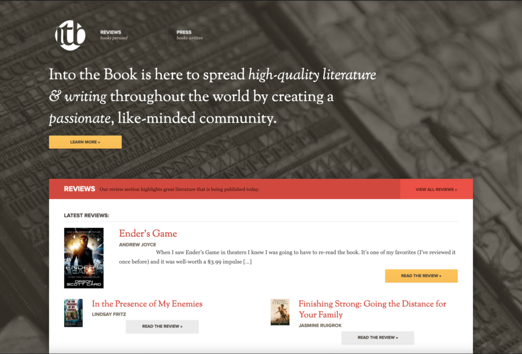
You can still buy an ‘ItB Press’ book: Orthodoxy by G.K. Chesterton. The others in the pipeline never materialized, nor did the indy books we signed.
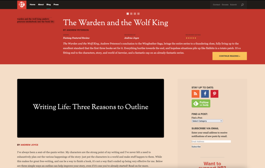
By 2015, I’d lost my free time to continue working on the site, and most of the contributors evaporated. I started thinking about ideas for how to relaunch the site as my own personal blog.
By 2019, I closed Mosaic Web Studios (my freelance imprint) and started my current job at Mere Agency. I had a work blog on Mosaic, but had closed my own personal blog (archive link) some years previously. With the proliferation of social media, I started hankering for a personal blog again, and what better vehicle than Into the Book?
I still read, I still write, and the community site is long-gone — so why not here (you can read more about this in my intro post to this series)?
Back to Color
Into the Book, as you can see above, has always stuck with the tan/gold/red color scheme. There’s been some variation, but I’ve always wanted to mimic a cloth-bound hardcover book with a ribbon bookmark, and so I’ve stuck fairly closely to that dusty library look and feel.
I like this, but I want the personal iteration of this site to feel, well, personal. I’m going to strike out from here radically.
When developing a color scheme, I personally always start with a few mood boards. These are great because they give you a sense of the feel you’re hoping to capture with the whole design, and are also really helpful for client communication, if you’re dealing with a client.
Here’s a rough approximation of my ideas for this site:


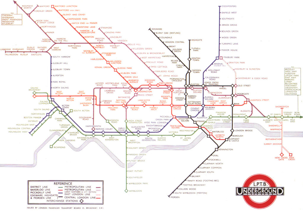
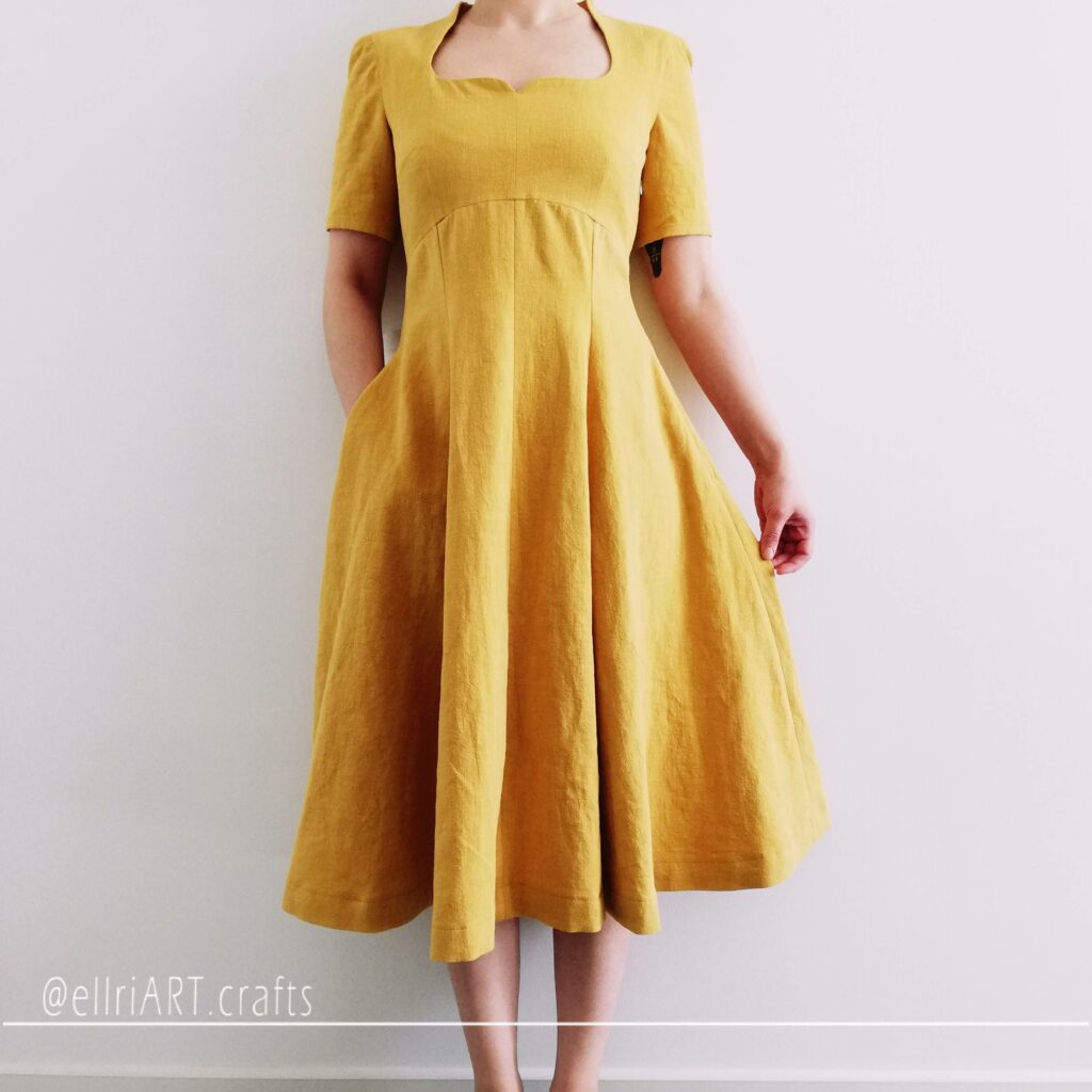

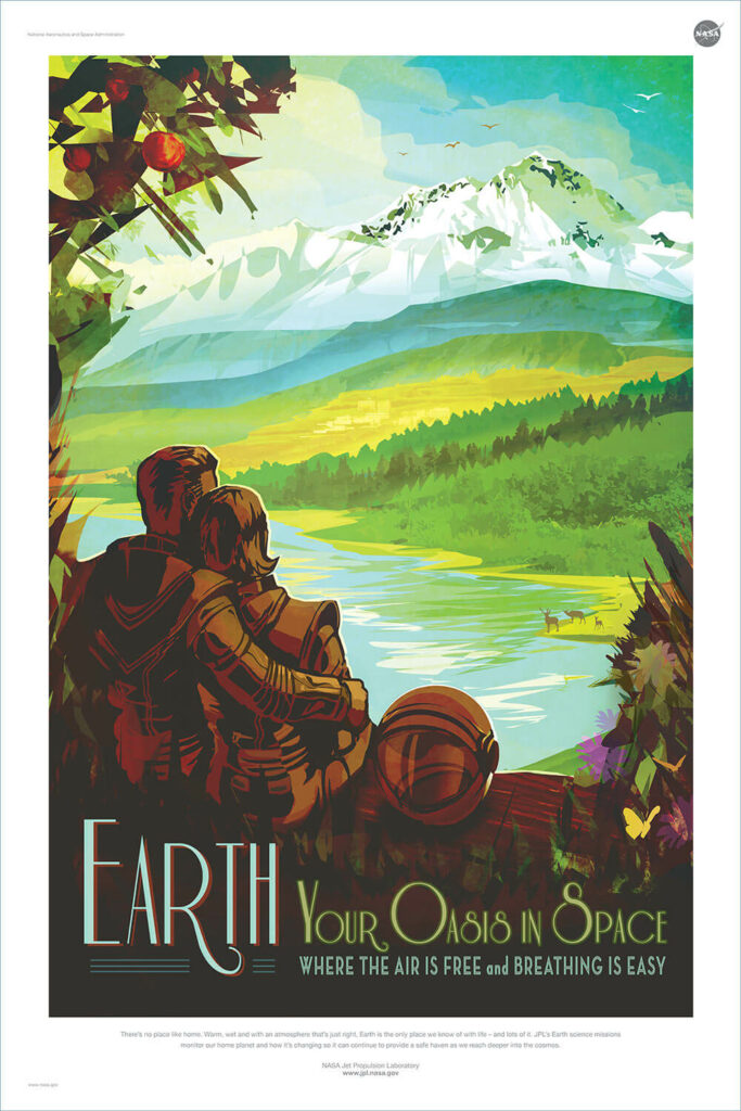
A few themes emerge: vibrant colors, specifically: green, yellow, blue. This is doubly unsurprising when you consider where I grew up:

Actually setting a color palette
Think nature trail meets space poster meets a weathered old book. This was my first by-hand attempt at a color palette.

You can see a lot of ‘Brazil flag’ in here, although I wanted a gradient color scheme that would let me use similar variations for different categories of the blog (I actually planned this same concept on an aborted redesign of Into the Book from 2014).
Contrast Checking
It’s important to check contrast against accessibility guidelines. I shoot for AAA grading when I set color schemes, but sometimes have to settle for AA. This is going to have an impact on the chosen colors.
I’m going with a dark color because, on the whole, I think I want a dark-themed website (most of my personal blog stuff in the past has had a predominantly dark scheme), and I think a dark color will do better with these hues. The chosen color, #161a18, is pretty dark but has a green tinge to it.
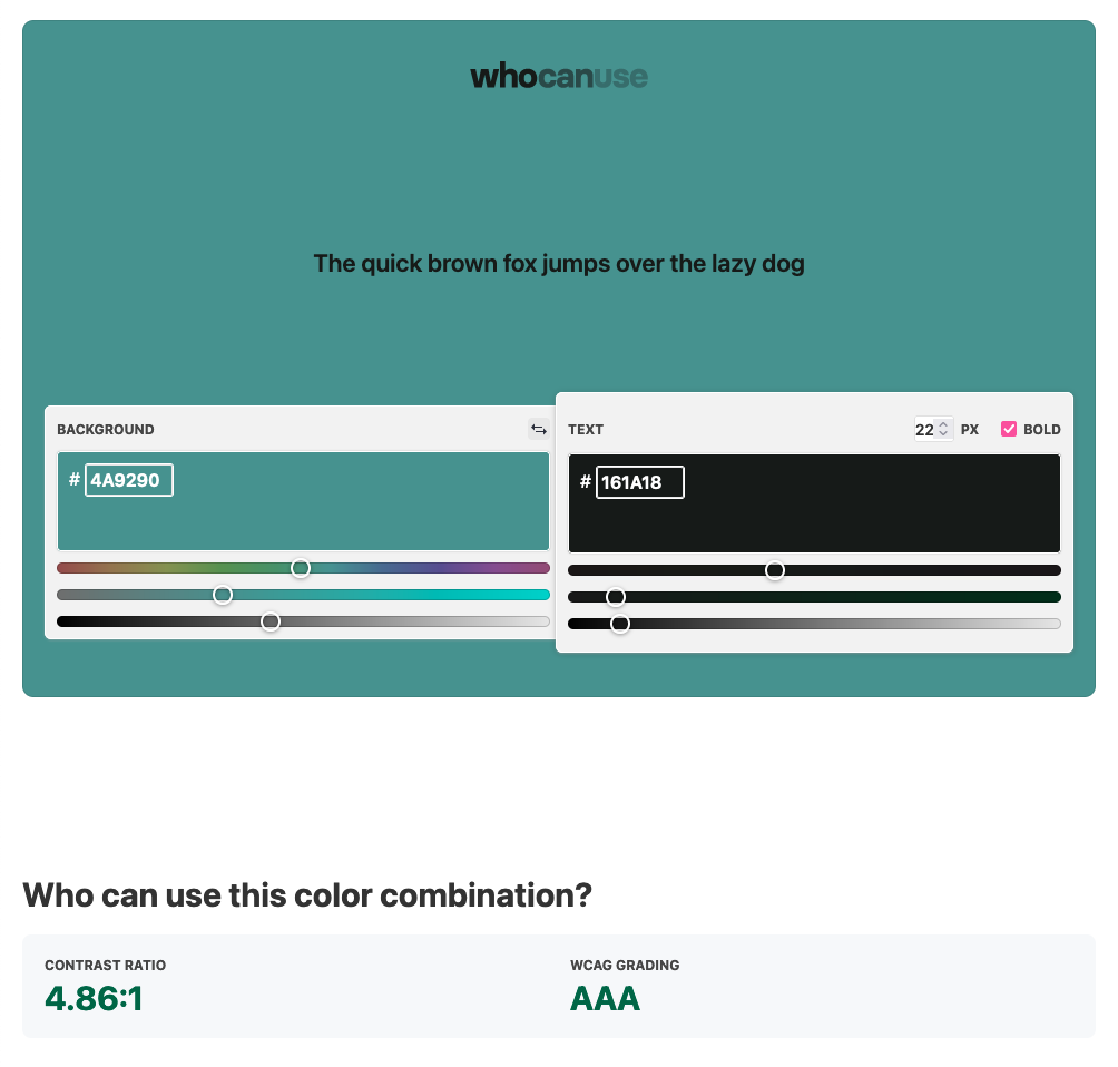
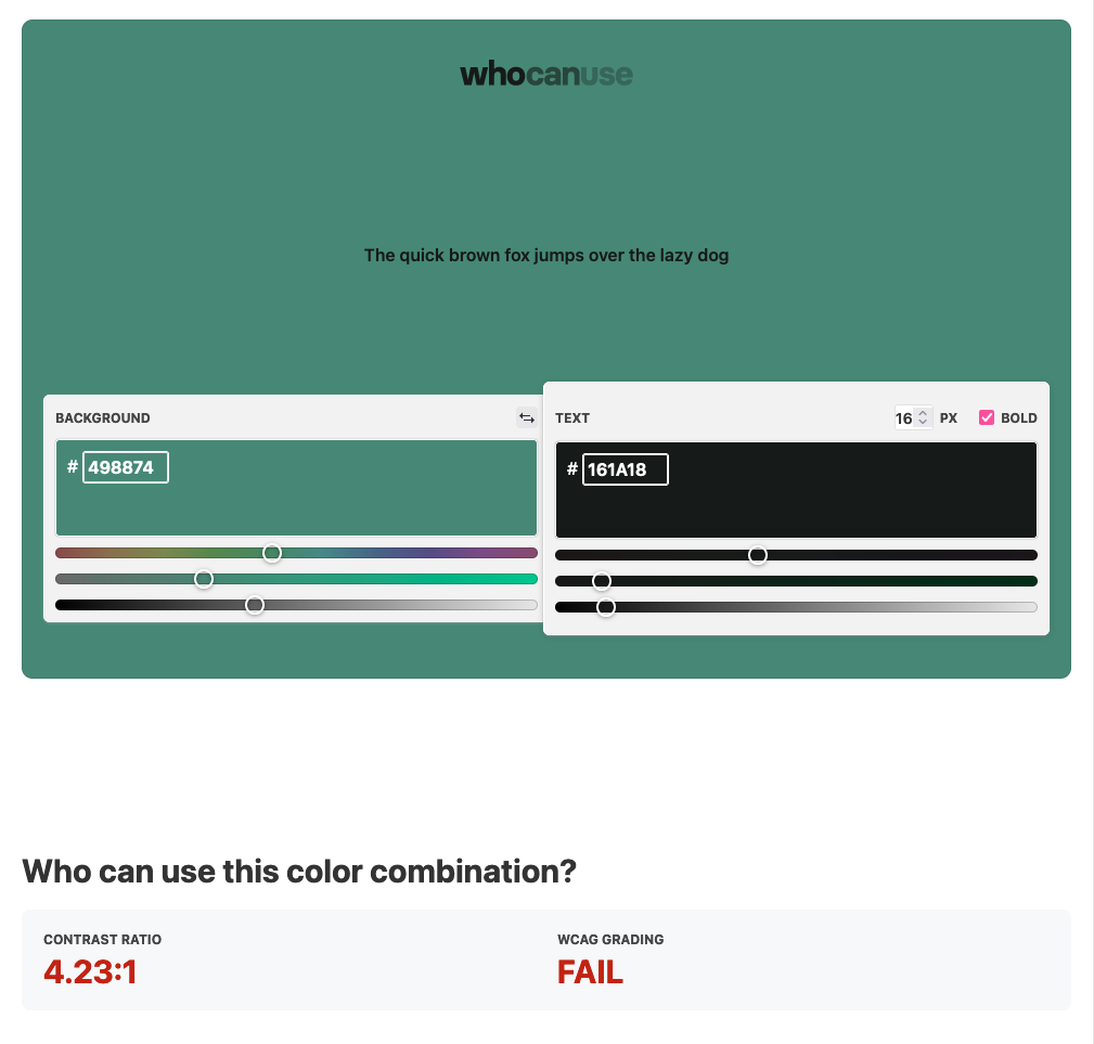
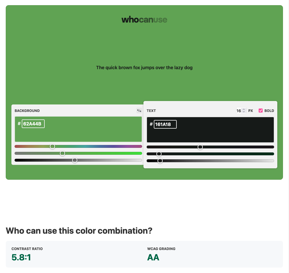
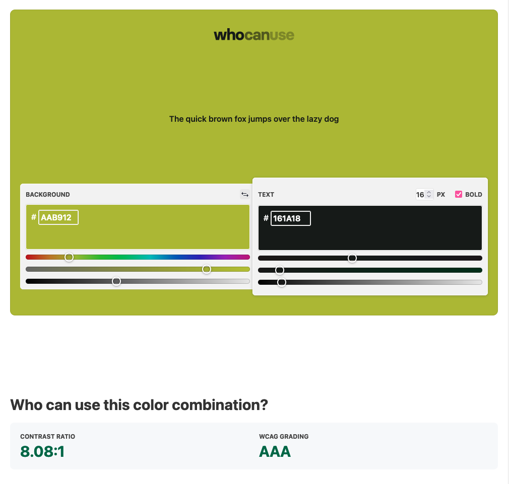
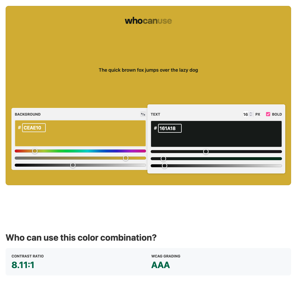
Let’s see how our candidate color scheme does. The tool I’m using is called Who Can Use and it’s a really invaluable accessibility aid. In addition to basic contrast grading, it gives you simulations of various types of color blindness and other environments that are less than ‘ideal.’
We’re going to test our design colors out at a font size of 16px — that’s comparable to body text. Some of our labels may be as low as 14px or 12px, but we can use all-caps text on smaller elements to compensate for the lack of contrast.
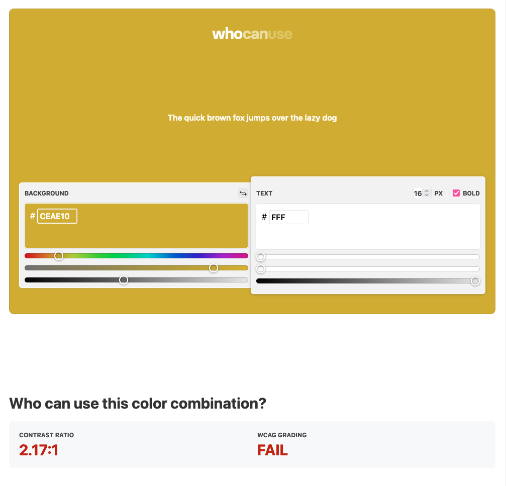
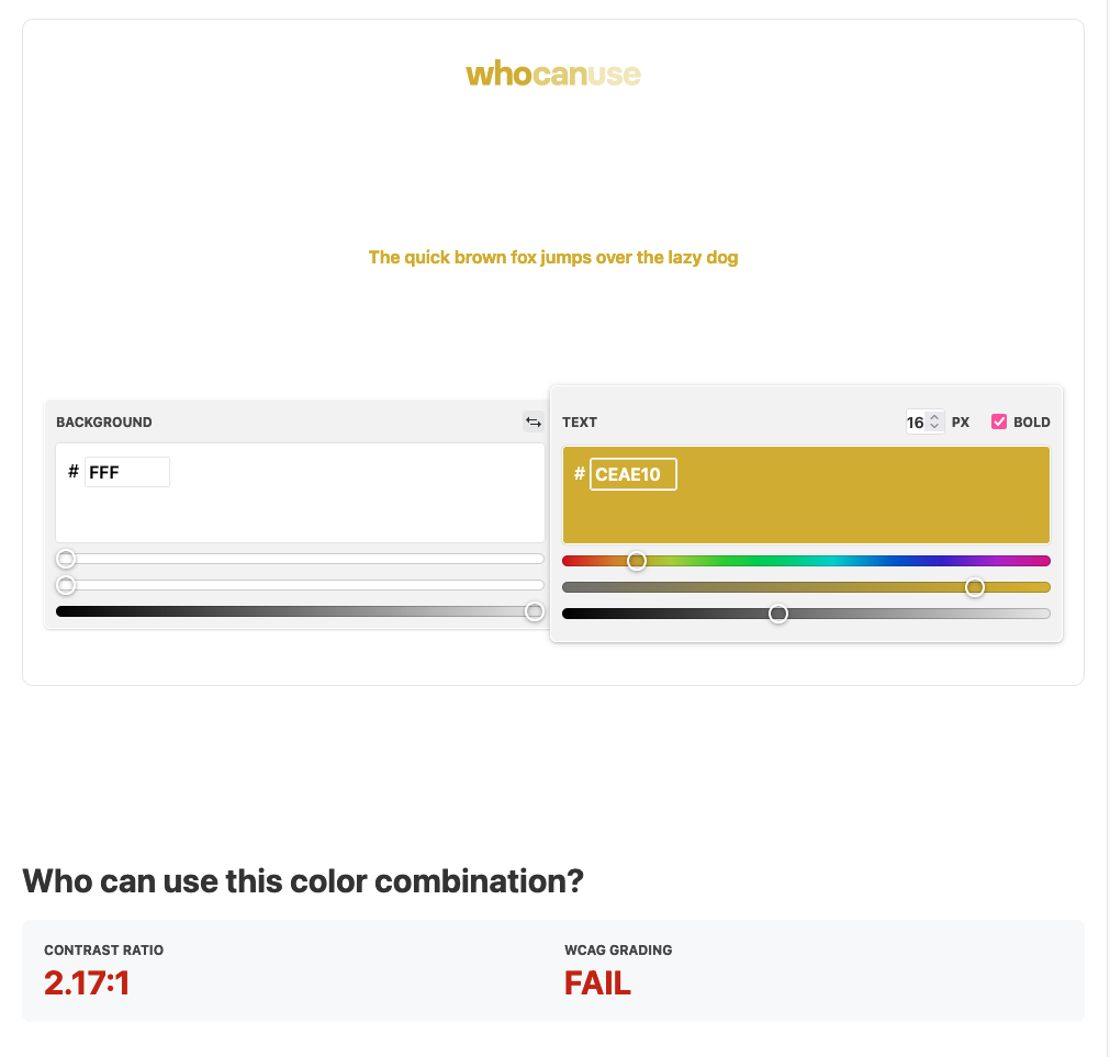
Overall, this color scheme does surprisingly well! The decision to go for a dark background with colored text (we tested the opposite, but all of these behave the same with reversed colors) looks like a good one. We only need to look at our yellow to see that white text is probably never going to work within this color palette:
That’s fine, though. Dark backgrounds are awesome.
A few other caveats: the gradient effect will probably not look ‘right’ for many colorblind users. Some colors might appear identical, so we should steer away from ever using color only to differentiate different section of the webpage.
However, since this is a personal blog, that’s a compromise I’d be willing to make. I like exploring a 5 or 6 color palette, where we might only have 2 or 3 for a corporate project.
Fixing the Failures
I’m choosing these colors with the HSB color system. It would be possible to take the starting blue, ending yellow, and divide the difference in their hues to achieve a consistent scale of colors. We could also increase the brightness and saturation by a constant rate across the spectrum of the design colors. This is a very programmatic approach to colors. Unfortunately, the result is a little…sterile:

I wanted to brighten everything. We’re working on such a dark background that bright, saturated colors will be our friend when it comes to contrast. I also want to make sure the colors are more differentiated than the original palette.
So here’s a second hand-crafted attempt:

I’ll spare you the tests this time around, but everything passes AAA on the WCAG test at 16px except for the left two teals. Great! We’ll still lose the gradient effect for colorblind guests, but at least the text will be legible; and that’s a compromise I’m willing to make.
For text, we’ll use white. I realize that white-on-dark is technically harder on the eyes, but there won’t be much longform content on this site, so for blog posts I’m fine with this. Maybe in the future I’ll rig up a theme switcher so that visitors can choose whether they prefer light or dark.

For headings, I don’t want pure white for everything. I’d like a medium gray that blends into the background a bit. Then we can use the large font size to increase legibility.
#9da6a2 does the trick quite nicely: full test. It’s AAA-pass at 14px, and our headings should be way larger than that in every instance. We can even use this for meta text and the like.
I also want a lighter variation of our background– something we can use in selected circumstances to create contrast. Our colors should still look decent on this, but I’m less worried about accessibility here since we’ll use this way less than the main background color. I picked #29332e for this.
Here’s our final color palette in context on the two background colors:

It’s looking great!
Next time, we’ll start to make some layout considerations, and I’ll update the Twenty Twenty One theme to use our selected colors (or at least, a few of them before we get to the full site development).
