Designing on the Web, for the Web
Article Posted: 1,685 words
We’ve been talking a lot at Mere about how we can build better websites for our customers. For me, though I’ve internalized mobile-first development and have been building mobile-first websites for about ten years, it feels like mobile-first design still has a long way to go.
For better or for worse, what we show the client at the end of ‘design’ is a desktop mockup of their website. But for many of our clients, this isn’t even their largest audience on the web:
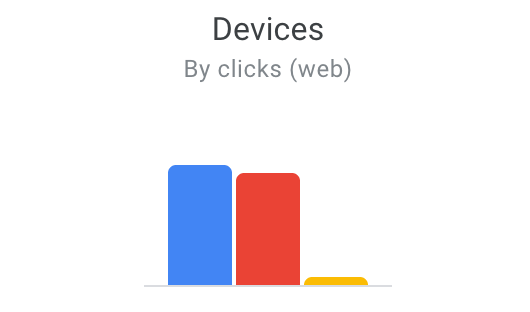
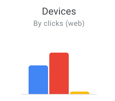
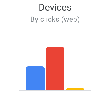
Mobile and desktop are both important. They both matter, and our typical method of ‘build desktop comps only’ just doesn’t cut it any more. As good as our developers may be, we’re actually asking them to shoulder design decisions when they extrapolate mobile layouts from desktop comps.
We’ve known that this is true for about ten years, but in those intervening years the task at hand has gotten harder. Phones are more powerful, and much more widely used, and even more devices have entered the picture since 2010. Developers deserve a better design mockup than just a static screenshot of a desktop site. There’s never been a time when one single mockup captures the experience of a website on the web less effectively.
In other words, a designer who cut their teeth on 1024×768 Internet Explorer and Photoshop Creative Suite 2 may also be carrying forward some incorrect assumptions about what a website design is and should be. I’m holding myself back.
Content: The Root of Mobile-Tastic Websites
At the root of it, we usually run into trouble when we haven’t worked out quite what sort of content a website will be serving. Whether because we incompletely understood the client’s needs, or the client forgot about something until a later stage of the process, missing content is most often what causes us to miss the mark on websites.
Content must be gathered and assembled first thing, in the early, early planning process. Part of the way we’ve changed what we do at Mere is how we build our wireframes.
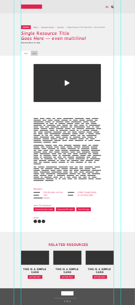
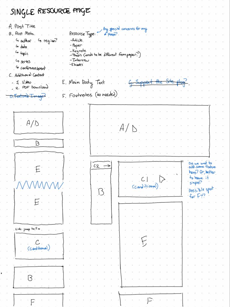
Do you see a difference? We’ve shifted our emphasis from the ‘look’ of the website to the content. The ‘before’ wireframes weren’t helpful. They looked almost like finished web designs, and left the client with expectations about the layout that the designer had to follow. If content or functionality needed to be added to the page, it’s expensive and time-consuming to rework the wireframe on the left.
By contrast, our wire on the right covers the exact same sort of page, but starts from a content-first assumption. The very first thing we do with the client is figure out a list of all the content and functionality that their key pages might need. Then, we map those items to a rough layout of boxes.
The key here is collaboration. We work in this world every day, but our clients might not. Handing off the left-hand image and asking them to ‘send along any feedback they might have’ might not be the best way to get helpful feedback from a client.
What’s Improved?
We’ve started sitting down on a Zoom call with a client, live, and talking through the right-hand outline. This way the client feels free to make suggestions, and we have ample opportunity to rearrange items on the fly.
The second wireframe makes no layout assumptions. Our designer, when they receive the wires, is still free to make decisions based on what’s appropriate for each screen size. It would be very difficult for a client to form expectations for the design based on the way that wireframe looked alone.
Speaking of which, the second wireframe has a mobile scope. Like we talked about up-page, mobile is typically the biggest audience for our clients, and most of the web at this point. Somehow, the second wireframe (which is far quicker to build and plan), actually makes more useful decisions as far as content priority and hierarchy, which is the whole point of a wireframes process in the first place.
What should a wireframe accomplish? For a project’s key pages, each wireframe must list what content goes where, and make some basic decisions about priority, hierarchy, and navigation. This produces a strong, content-first framework for the designer to run with.
Design: Throwing out Static Mockups
I’ve been doing a lot of thinking lately about mobile-first design, and realized that while I may build mobile-first development, I’ve never considered the ‘phone screen’ first when designing a website.
What I’m eager to do is to continue experimenting with ways I can make mobile design a first-class citizen on the web. A great example of what I mean is this recently-published essay. I built this so that it would read nicely on mobile and desktop, but the effect of the ‘chat’ messages is far better on mobile. Reading this essay is so much more immediate on mobile, with the chat messages sliding in much as your own text messages might.
How can I translate this sort of mobile-first thinking to static comps? Mobile demands different accommodations than desktop. Where there’s room for a list of posts on desktop, for instance, these might be better-suited to swipable cards on a phone screen. A design should make different decisions around hierarchy, priority, and total information density based on the screen it’s being viewed on.
A design should make different decisions around hierarchy, priority, and total information density based on the screen it’s being viewed on.
Many of my efforts over the last decade have been misplaced. I’ve displayed content in the same ways a million times across a hundred websites, and what’s changed has been the brand — the wrapping paper, if you will, around the content. It’s much harder to design a website that considers the content first, and makes decisions accordingly.
Not only is this difficult, I think it’s a foreign concept to much of modern web marketing. Websites are elaborately designed, pushing an organization’s brand just as much as they communicate actual content.
I don’t have many good answers here, though I have ideas. How can be build experiences that are best on mobile? What if the ‘one true’ website we build was the phone version, with a few tweaks upward for larger screen sizes?
This is a content-first philosophy that will be difficult to bake into our processes, but I feel strongly that it matters, in order to be consistent with what we tell our own clients: your message matters most.
Picture websites that are more RSS reader than flashy billboards. Simple designs aren’t just an easy way out (in fact, they’re often harder to design). We would no more want unnecessary decoration around the content than we would want our browser tabs to ‘feature’ lime green text.
A website is at its best when it solves the audience’s problem, and then gets out of the way. When we look at the analytics, that means starting from the phone and working outward.
Consulting: How we Talk about Websites Needs to Change
I am left wanting to double down on the content that makes up the websites I build. While this won’t be every website, we’re fortunate to build for clients that have complex content needs (recently, Bible to Life, White Horse Inn, or Baptist Press). What if our philosophy on these websites was to make the content even clearer, and even more readable? If every design decision was made with an eye to keep the content clear and easily accessible, I suspect we’d worry less about the ‘design’ of websites. I don’t worry about the design of my can opener — I just want it to do a good job.
That is the design of a website. How you navigate breadcrumbs is design. But this is a tricky balance to walk, because client expectations do not line up with this neatly. Clients are conditioned to think of their websites as walking brand billboards, not discreet vehicles for the real star, their content. When we mention design, our clients (and, often, us too) picture fonts and logos and colors, not layout choices, navigation choices, and content hierarchy choices.
Focusing on a waterfall-style, one-and-done “design” that’s monolithic and difficult to revise doesn’t do our clients a service. It teaches them that the visuals are plastic and their “own thing” on top of the content.
Focus on functionality, not chrome.
If we shape client expectations over many iterations, we can bring the expectations slowly in line with our recommendations, and have many more opportunities to explain our thinking to them. If we avoid a ‘big reveal’ where we present one big polished desktop comp, perhaps we can course correct slowly over time. Making multiple versions and tweaking the design is not a bad thing. It reflects how websites are in the real world: a collection of many different components.
Reframing this starts way back in the earlier stages, and I suspect it will be a slow evolution. As the sites we build gradually hew simpler and more in line with their content, our new, walk-on clients (the vast majority of whom come on board based on our current work) will be predisposed to accept our design style because it’s one of the things that will have drawn them to us in the first place.
The point of a successful website is still unchanged and will remain unchanged: promoting the client’s content, and making the content easily browse-able and accessible by all of their audiences. Our job isn’t to shoehorn in more branding for the customer, or make a website that they’ll love. It’s to serve the content, and by extension, the client’s audience.
For Further Reading:
- The Web’s Grain — Frank Chimero
- What Screens Want — Frank Chimero