A Comprehensive Review of the Remarkable Tablet
Review Posted: 2,662 words
Ever since I first came across Michael Mace’s post “Desperately Seeking the Info Pad,” in 2007, I have also been searching for this mythical ‘info tablet.’ I’ve been using OneNote for about as long, and it’s long been the hub of all my note-taking and information gathering. This sort of mythical tablet was a long way away in 2006, and now I think I’ve finally got my hands on something that fits the bill.
In February I got the opportunity to purchase a Remarkable through work. Thanks to rethinking how we’ve been planning out websites, we had need of a tablet that would let me scribble out navigation patterns and basic layout diagrams. The ‘killer feature’ for us was the ability to screen share the drawing live to a computer, allowing me to easily sketch out ideas live on a zoom call with a client. All of this was far more collaborative than what we’d been doing before (static comps painstakingly assembled in a design program, which were a pain to update and often gave the client unrealistic expectations of how closely the design would track with the wireframe).
All this to say, I’ve now been using the Remarkable for six nine months (finish your drafts, people), and I think the pros and cons have sorted themselves out. I dislike reviewing tech products when I’ve only been using them for a short time: half a year is plenty of time to work out how this tablet fits into my life. On the whole, it does so seamlessly, though there are a few things I’d still like to change.
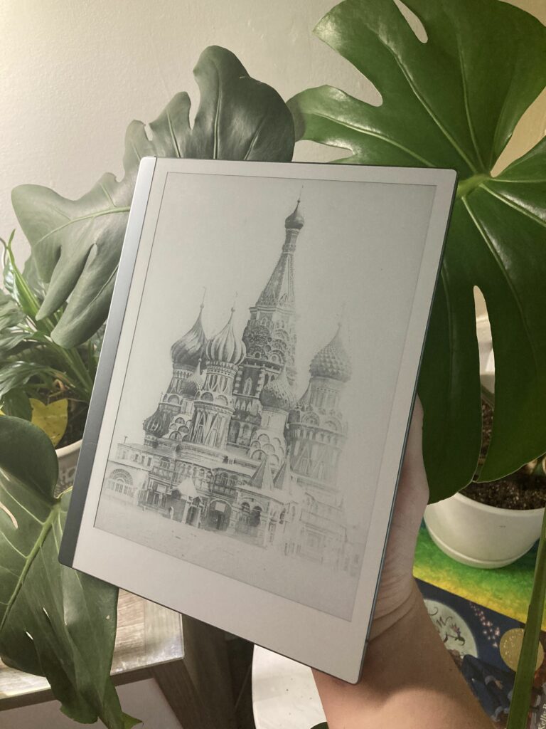
The promise of the Remarkable is a laser-focused device: this is for note-taking, and note-taking alone. There’s no email, no calendar, no extraneous features. I did look at some other tablet options (the SuperNote has a few more useful features, and the Boox Note is a full e-ink Android tablet; most recently, the Kindle Scribe has come out) but I was attracted to the Remarkable’s promise.
The Physical Product
Much like Apple, Remarkable has taken great pains in the physical design of this product. I’m a firm believer that industrial design does matter in how often you use (or want to use) a product, and the Remarkable does a great job of this.
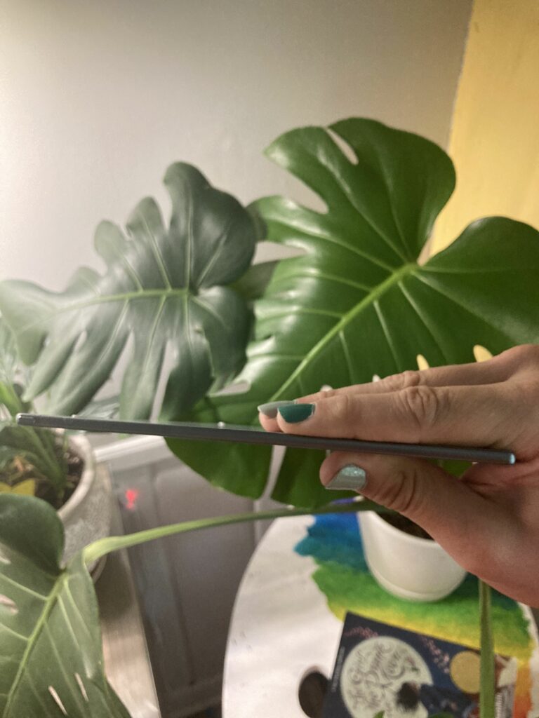
First of all, it’s impossibly thin. I had an opportunity to play around with one before buying, and I was struck by how tiny the thing is. Apparently it’s so thin that the size of the device is part of what causes the pen to drift a bit over time. That’s easily fixable, and my overwhelming impression of the device is that it’s intentionally made to be small enough to take just about anywhere. I’m not quite to the level of chucking it in my backpack like a notebook (this is a $500 notebook, after all), but I do carefully put it in a pocket of my backpack, or tote it to church for sermon notes. Recently I was even marking up wireframes for work while waiting for a Valvoline oil change; so, physically, it’s not a burden to integrate this tablet into your life.
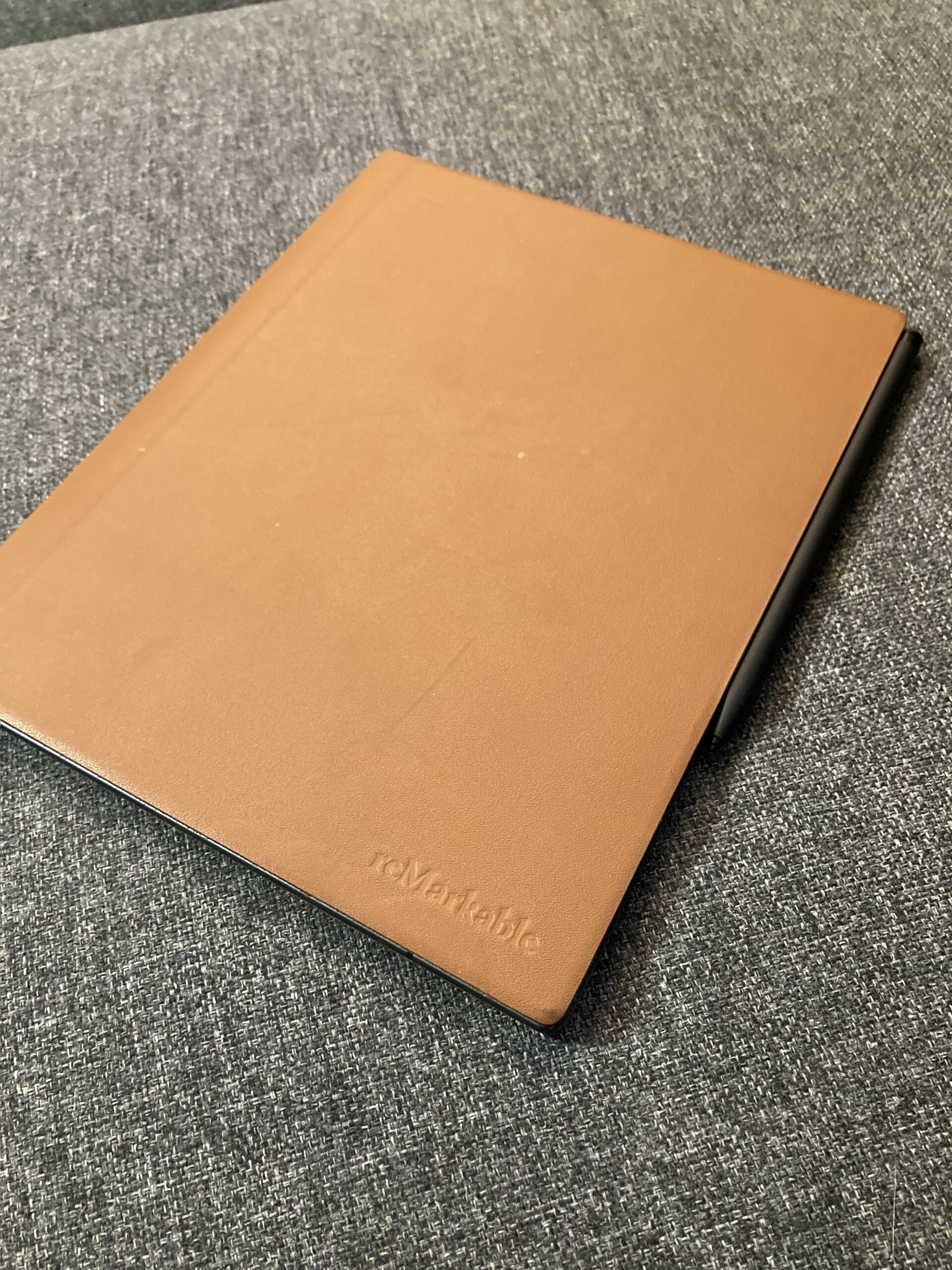
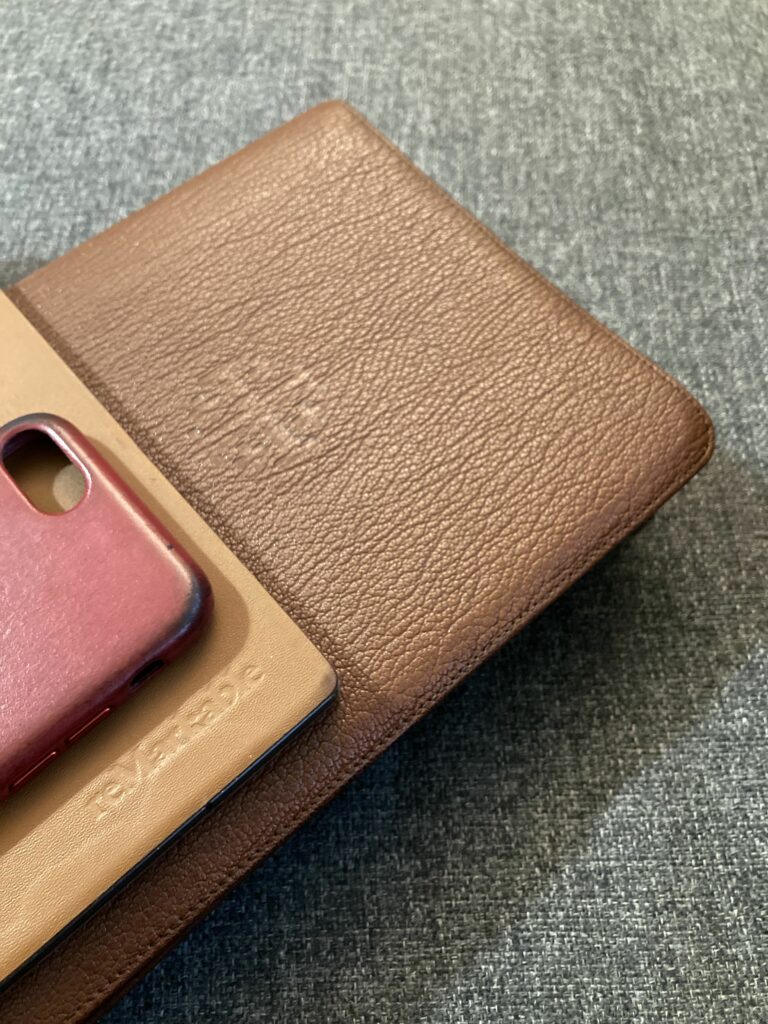
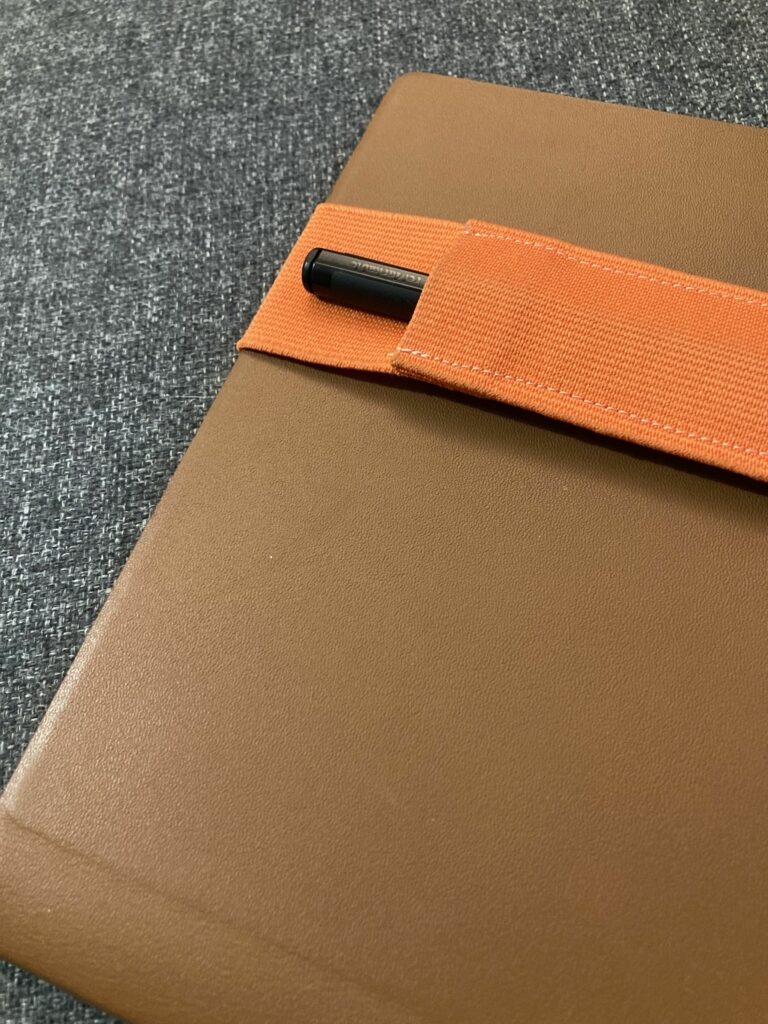
I wouldn’t buy the book fold case again — the leather corners are starting to wear in the same way the iPhone cases wear: painted leather that is mostly black underneath. This is not really a ‘patina’ in my book, it just looks dingy. To make matters worse, the case has no raised corners so it provides vanishingly little drop protection, though I suppose if you only drop your tablet flat on its face, it would be OK. I’m looking into some other case options.
The pen is similarly mixed. I love that it uses Wacom tech to never have to be charged — the pen just ‘activates’ on the device itself, which is great. That said, I’m a little concerned with durability. I’ve already had one replaced under warranty, and for the life of me, I can’t figure out when the nib housing cracked. It’s the sort of thing that makes me really cautious about sticking this in a backpack. There are a few other pens that are compatible with the Remarkable — so it might be worth checking one of those out.
Battery life is amazing as you’d expect from eInk. I’m pretty sure I get two or three weeks, at least, on one charge. It’s so infrequent that I don’t remember the last time I plugged the device in to charge.
(One more thing — after 9 months of daily use, the power button is starting to be a little finicky. It really only activates when I push on the right-hand side of the button. I’ve adjusted, but it worries me that the connection may go out altogether)
The Software
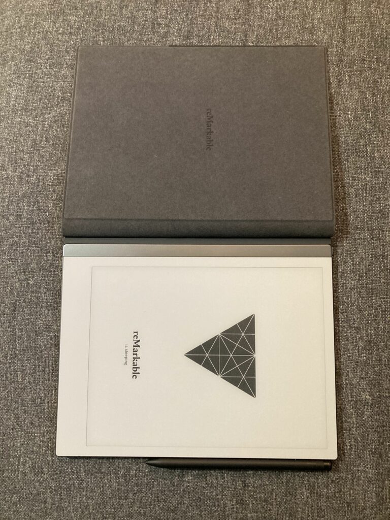
In terms of software, Remarkable have kept this tablet really simple. It can read ePub books as well as PDFs (and you can mark up both of these), and of course, you have the digital notebooks that make the tablet what it is. Within any file, you have ample markup options. Let’s take a look at these features:
Reading
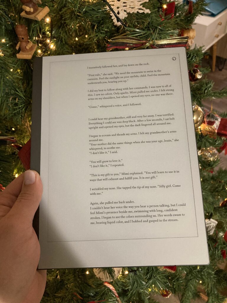
The Remarkable makes a fantastic eReader. I personally prefer the extra space you get relative to a Kindle or a Nook. Sure, it’s intended for marking documents up, but even in reading, I appreciate that even with large text I get about as much text as a standard book page. The only thing that would make the reading experience better would be hardware page turn buttons, but the swipe to turn is easy to pick up.
One note here — the Remarkable has no support for Kindle ebooks. If that’s what you want, the Kindle Scribe will be your best bet. But, as an ex-nook user with ample, ahem, methods for removing DRM and converting between formats, this is no problem for me. I brought my entire (DRM-free) Nook library straight over to the Remarkable. I can’t manage the device directly in Calibre, which would be nice, but I can at least drag and drop .epub files between Calibre and the Remarkable desktop app, where they sync to my device.
If you have a robust library of epubs, or honestly, even PDFs, the Remarkable is going to shine. I use it as an eReader multiple times a week.
Marking Up
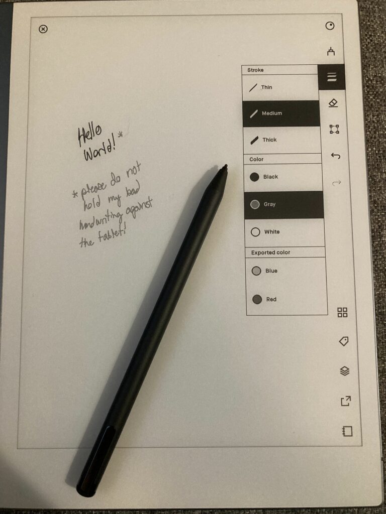
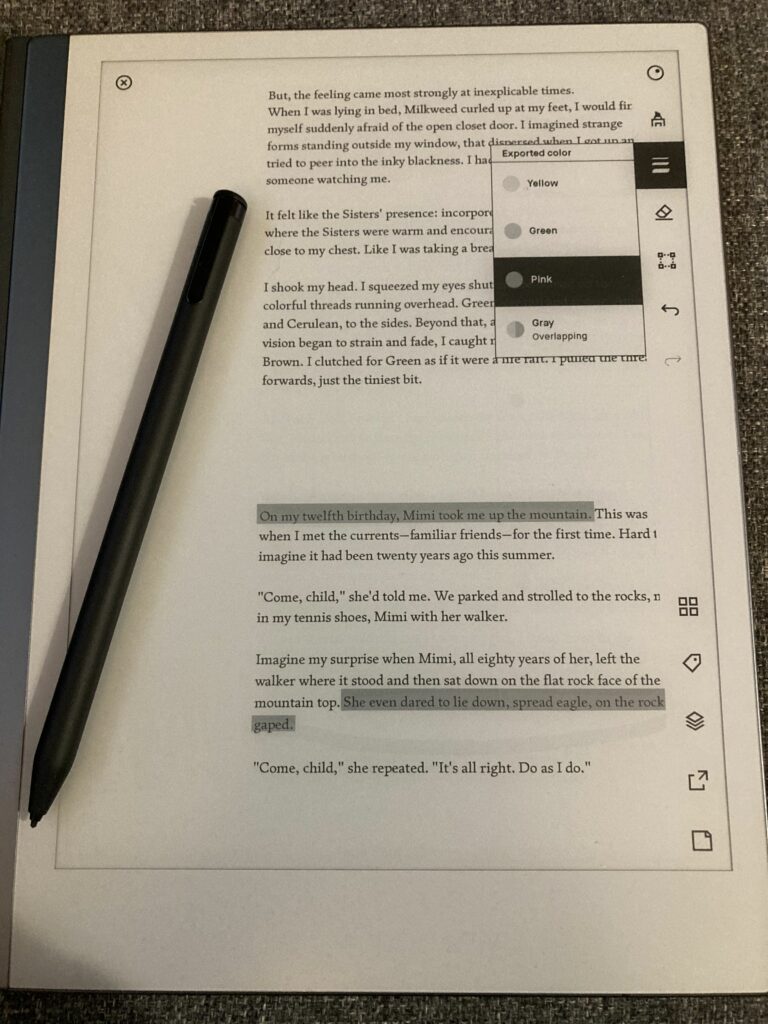
The Remarkable is a fantastic markup or drawing tool. For my use case of drawing low-fidelity website wireframes, it’s absolutely perfect. Any artist wanting to draw on the tablet will find frustrations here: while there are many different pen types (fineliner, pencil, pen, brush, eraser, etc), accuracy is probably 98/100, and of course you’re only working with greyscale.
The tablet does have a few color options: pink, yellow, and green highlighters, and blue and red pen colors, but these only show up when you’re on the desktop app, naturally.
The most useful tool by far for me has been the magic lasso — being able to select and copy-paste chunks of writing or drawing is super powerful, and I wish they had a few more tools in this vein. A ruler tool to help you draw straight lines would be the last tool I feel would put this tablet over the top. As it is, I carry a tiny plastic ruler inside the case that I use for straight lines — as long as your ruler won’t scratch the screen, this is a fine workaround.
I wish there was a soft keyboard. We know it exists because you can rename files on the Remarkable. Now, typing on the tablet itself sounds painful, and that’s not really what I envision, but adding ‘typed text’ as an object on the screen would unlock adding text to your notebooks from other devices, which I believe would be a completely killer feature. To have a way to add to your digital notebook — even when you don’t have it with you? It would make it even more useful to me!
Writing on the Remarkable, even as a lefty, is a joy. My arm doesn’t get sore (there’s less resistance than a real pen), but there is just enough resistance that it feels like writing (unlike, say, an Apple Pencil on an iPad, which is an experience I could never get used to).I bought some replacement nibs that are actually even less resistant than the Remarkable’s nibs, and I like switching out between both options. Writing feels ridiculously natural — and thanks to the eInk screen, it looks just like writing in a notebook.
Sync Software
Things have changed since I purchased the tablet. The Connect subscription is much cheaper now, and basically makes Remarkable’s own server sync work. For my money, this is $2/month well spent, as I have access to my notes on Mac, iOS, and Android all the time. I can’t edit on the other devices (yet!) but I can at least view what I’ve already written. Meanwhile, features that used to be behind the paywall — Google Drive/OneDrive integration, and screen share — are now free to all, which is a big deal.
One thing to mention about the GDrive and OneDrive integrations — they are largely cosmetic. You can’t access Google Docs comments from the Remarkable (which would let me process client feedback on-device), and Remarkable doesn’t directly edit your online file. Instead, it downloads a copy, and later uploads that copy back to the drive. This is handy, but maybe not quite as handy as directly editing a file. And seeing and responding to comments would be killer.
Remarkable got it right the second time — the price is right for what you get, and for most people, it’ll be an essential they can’t live without. I’m also glad they didn’t keep on-device features like the screen share locked behind an arbitrary subscription paywall.
If there was somehow an option to sync with Microsoft OneNote (the new 3.0 update promises to add infinite-scrolling pages just like OneNote) and add text in either product, I would pay hundreds for that privilege. As it is, I don’t feel like I’m missing much, and I’ll continue to happily pay the Connect subscription price because syncing is so convenient.
Screen Share
Screen share is the raison d’etre for this product, in my book. Granted, this is for my use case, but it’s difficult to overstate how handy this is. Once we’ve completed an initial draft of wireframes, we get the client in a Zoom meeting and share the Remarkable screen. From there, I present it as if it were an exported PDF, but anytime the client notes something, I can change it live on my tablet which is sitting in front of me. Screen share also activates a red laser pointer which displays on the shared screen when you are hovering the pen over the physical tablet.
It’s all super slick and seamless, and we use it every single time we present wireframes. The only con here is that screen share mode drains your battery — a lot.
Customization
A quick note about customization — it is possible to add features like your own lock screen (mine is pictured above), or custom templates for your notebooks. But with a catch.
First off, they haven’t made this easy to get to. You’ll need to SSH into the tablet or connect to it with an SFTP program, as well as update a .json file to add the templates to the list that Remarkable searches for. . It wasn’t too hard for me to figure out — there are some good tutorials — but it’s far beyond what the average user would easily accomplish.
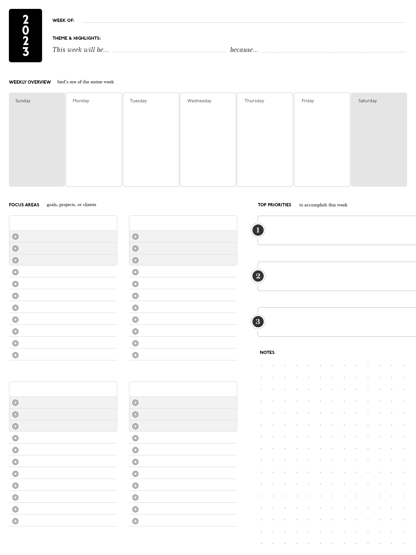
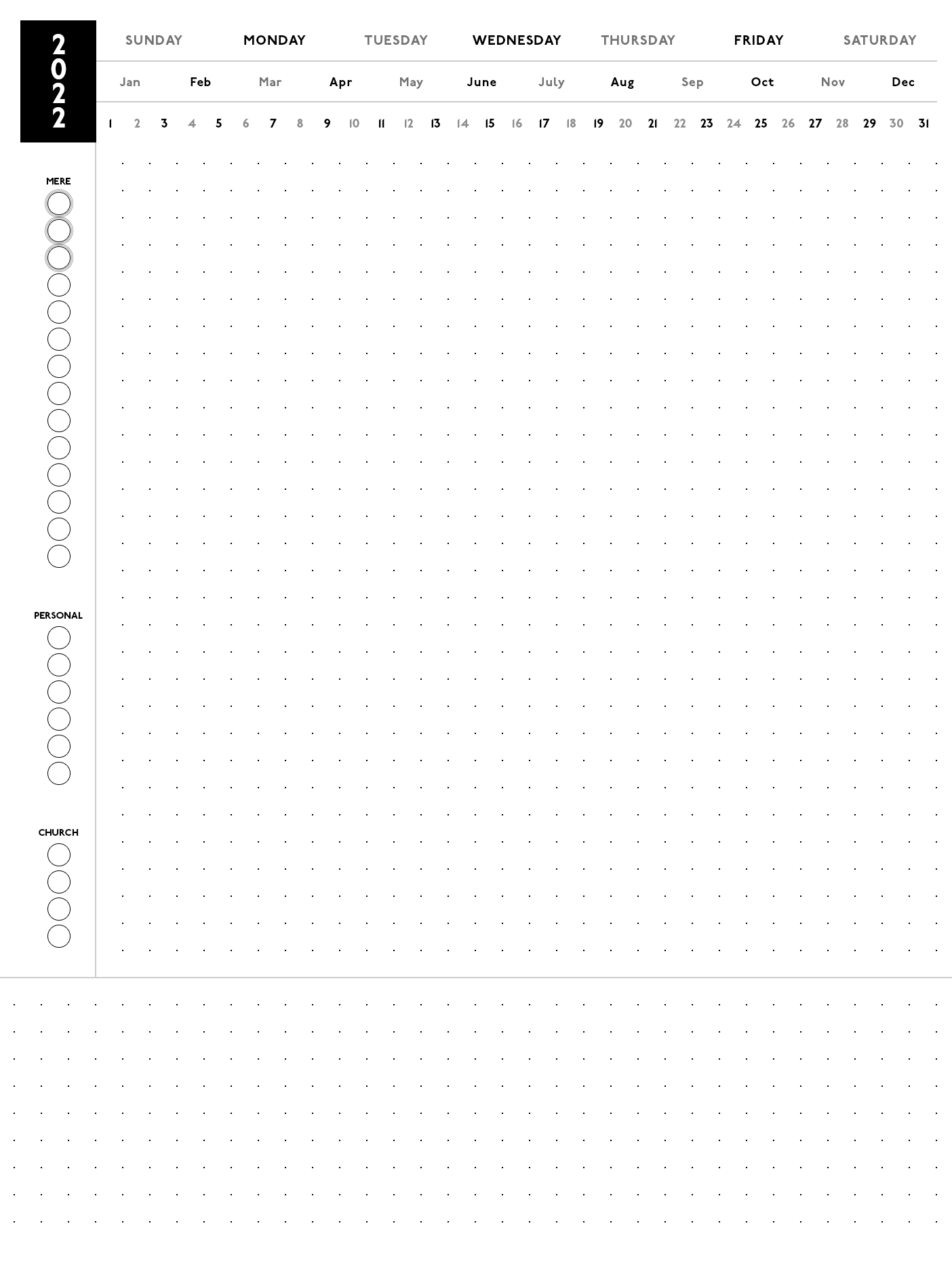
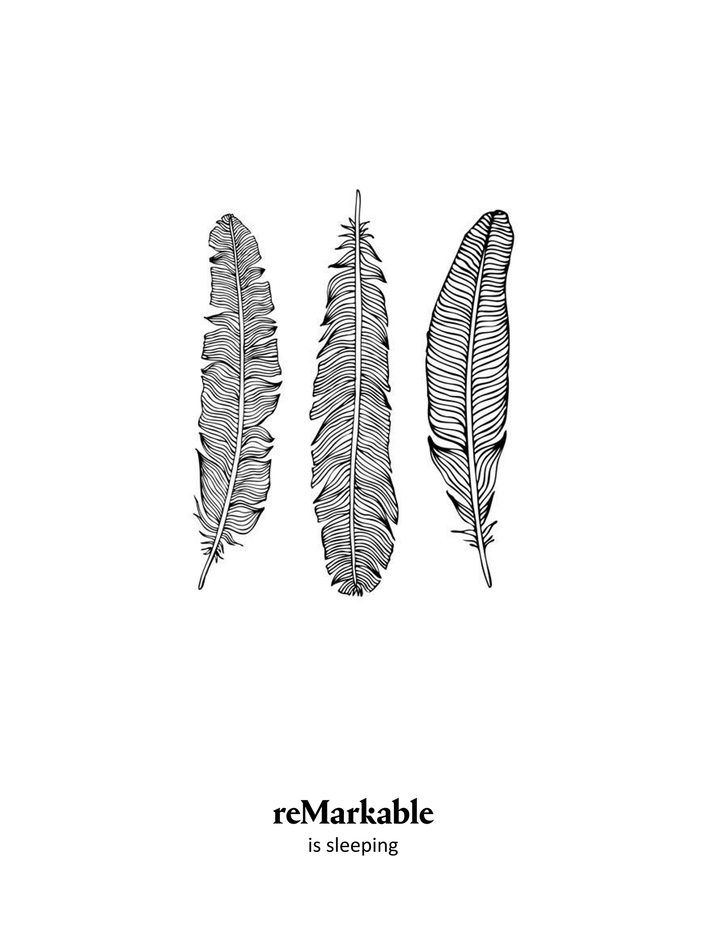
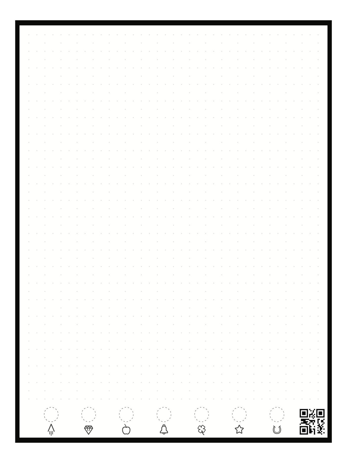
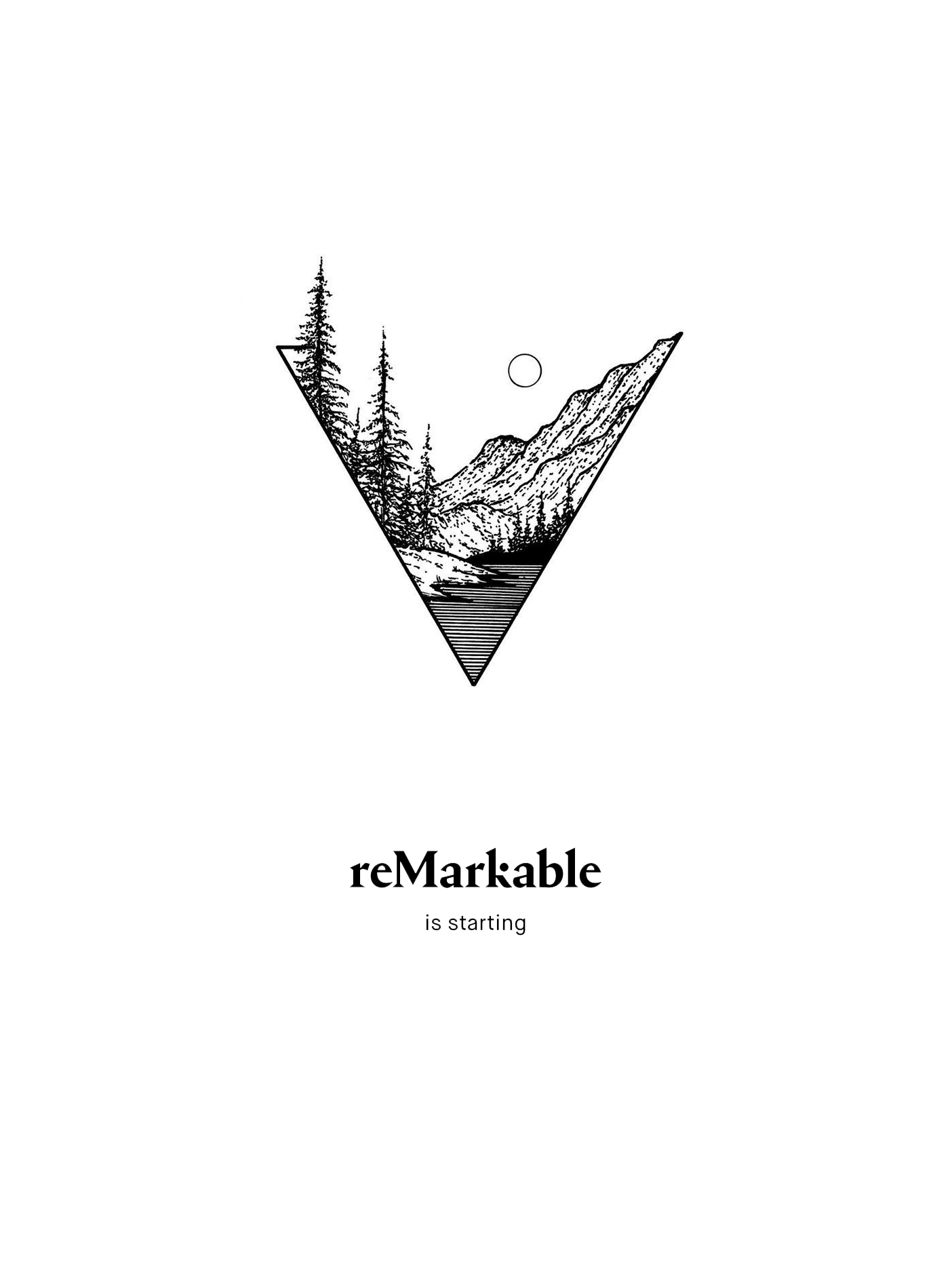
There is a third-party program called Remarkable Sidekick for MacOS, but as of yet it only lets you view all highlights on device and change your lock screen. I would love a more graceful way to change templates.
Because of the way the Remarkable updates, you can’t even just set it and forget it. Each update will erase your changes, and you’ll need to re-connect to the device and transfer them back over. It’s a pain, and it makes it clear that Remarkable don’t really intend for you to customize the device this way.
But, especially for the planner: it’s worth it. Each new page will have the exact same template, and this has become an essential tool in my own organization.
Final Impressions
This tablet is nearly perfect. It’s become the cornerstone of my productivity. A brief list of the things it has replaced in my life show how ridiculously effective this purchase was:
- Bible (I take the remarkable to church — in tandem with the ESV Digital Scripture Journal I can follow along in the passage and take sermon notes)
- To-Do List (most recently, replacing Microsoft To-Do on my phone/computer)
- Day Planner (replacing, er, nothing)
- Getting Things Done lists (my next/someday/maybe project lists which were just papers on my desk)
- Wireframing tool for work (replacing Adobe XD/Figma)
- Note-taking for meetings (replacing mostly Microsoft OneNote and random scraps of paper)
- Habit Tracker (replacing an app on my Android phone)
- eReader (replacing a busted Nook)
As a web designer, a computer will always be an indispensable part of my life, and to be honest, I thought that would be the only work tool I would always 100% rely on. The Remarkable proved me wrong. It instantly slotted into my workflows so naturally that I can’t imagine working without it. Is all of that the Remarkable specifically, or does this just mean eInk tablets are really cool? Well, it’s hard to say — my colleague ordered the Boox at the same time as me, and it’s general-purpose Android tablet nature has made it less useful rather than more. There is a sense of ‘jack of all trades, master of none’ going on here. The Remarkable does a few things very well.
I didn’t have to agonize over the cost of this device because I didn’t spend my own money on it. But after 9 months, I can confidently say that I would have spent my own money — and not been disappointed. The peripherals are another story: neither the pen nor the case are so good that they’re worth >$100 (at the time of writing), and it seems there are lower-cost options available for both of those peripherals. But the device itself? Absolutely. Slam dunk.
Mike Mace, at long last, this is my info pad.
Disclosure: Amazon links in this post are referral links — if you purchase a product by clicking on one of them, I earn a small commission.