V6: The new ItB design is done!
Update Posted: 1,037 words
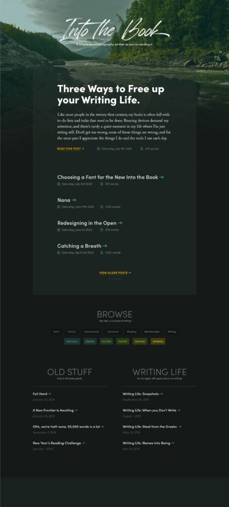
It took long enough, but I finally made good on my January 2020 promise to redesign ItB in the open. From fonts, to colors, to now, a new blog layout, everything is in a place that I’m termporarily happy about. There’s even some new content that’s not redesign related!
The Design: V6 mixes moody and vibrant
After publishing my font and color choices for ItB, I opened Photoshop and built a static, desktop web mockup (I’m not totally happy with this step of the design process, but that’s for another post!)

There was no mobile design for this site. I figured it out in the browser (again, more posts on this soon as I’m not totally happy with my current design process). Similarly, I figured out the Archives page in the browser as I went along. I did some very basic mocking up of the topic/category page headers, but other than the snippet below, I built those pages in the browser, too:

Checking the actual design on actual phones throughout the build was crucial to making sure that things lined up right, felt natural, and worked properly on the smaller screen. Plus, since this is a personal blog, I’m free to tinker and improve incrementally, gradually building out an effective website.
My design process has never been fully in the browser, but my polishing process certainly is. Rough ideas work out differently on the screen than they do in the design app. I’ll continue to polish this design as I actually use it.
Let there be Light — or Dark
For the first time, I’ve dipped a toe into automatic light-and-dark themes thanks to CSS Custom Properties and the great prefers-color-scheme media query. Contrast and readability should be fine everywhere, but there may be a post or two where a header background image makes for unreadable text in one format or the other.
At any rate, in this designer’s opinion the website is best browsed in dark mode, but accommodating light mode felt important, especially given that for longform text, it can be less straining on the eyes to read black on white. I hope you enjoy playing with the site, in both versions.
The Content: and some new additions
I’ve been doing a lot of thinking about permanency on the web. I’ve been blogging online in some capacity since 2009, and I believe that a lot of this — except for retraction or other philosophical changes — should continue to remain online. As such, I trawled archive.org for a lot of content no longer available on the web, as well as my own document folders for posts that I had published and lost.
You can browse this archive — and see the most-complete record of my writing over time that exists — on this Archives page. Every year has a simple line-graph of how many posts were written in that month compared to other posts in the year. Some of this writing has been offline since 2014, and other pieces have never been published. I’m hoping to continue filling this out as I look through my own archives.
I would recommend you read Chronology in a Virtual Space, as it reflects some of my thinking around this particular page. At this time, the archive is strictly chronological by date of publication, although I still think about additional mechanisms to order it by significant life event, or by time it is set in (would that be useful to anyone but me?) I would love to hear your thoughts on the matter, if you have any!
Yet to be Done: because who’s ever really satisfied with things the way they are?
Like any personal website, there will always be a few things unfinished that I’m hoping to wrap up. Here’s the list as it stands as of March 1:
Some parts of the site are incorrectly using the 200 font weight of Sofia Pro instead of 300. Grr.- Finish theming the category/topic pages (I would like to push the colors you see on the homepage further onto those individual archive pages)
- A permanent Colophon page that details font/typography choices, as well as a full color scheme (just for fun)
- Individual feature blocks on the homepage as seen in the static design. I’d love to be able to surface, say, every post on the redesign in one block on the homepage, or hand-picked posts from the archives that are still worth your time.
- Some way to toggle dark/light mode beyond your browser-wide settings.
- Image compression on the header images is a must — some of them are bigger than I’d like!
- Find some way to support pingbacks or webmentions, even if no one is using them right now.
- An actual 404 page instead of a totally blank nothingness
I also have a few goals for Into the Book and my own writing in general (non-technically):
- More articles on more aspects of myself (this is what a personal blog is for, right?) I’m interested in posting some of my articles about board gaming as there’s interest, and continuing to explore web topics as this is, after all, a web site of a web designer.
- More consistent articles? I enjoy who I am as a person far more when I write, and would like to publish more than one post a year, if possible!
- Static pages for my larger writing projects (Here is an example for Currahee) need a lot of improvement/fleshing out (they’re also not linked anywhere on the site).
Thanks for taking the time to read and care about this corner of the web, old-fashioned and personal-blog-esque though it may be. I hope you enjoy your stay here.
If you missed it for the one week that it was the top post, I’d commend my Firewatch review to you as one of the better pieces of writing I’ve produced lately 🙂 As always, feel free to add Into the Book’s RSS feed to your favorite reader if you’d like to stay up to date on new posts as they come out. See you again soon!
Andrew